


UX Research and Iterative Design for Inclusive Restroom Access
Summary
As the UX researcher and designer for the tinkl app, I contributed essential early-stage evaluation to improve a functional prototype that helps transgender and nonbinary individuals locate safe, gender-neutral restrooms. Through a cognitive walkthrough and contextual inquiry, I identified usability barriers, clarified user needs, and surfaced opportunities to strengthen accessibility and trust. My work informed the app’s interaction patterns and guided the direction for subsequent prototype iterations.
Methods
Cognitive Walkthrough, User Research, Contextual Inquiry, Digital Wireframing, and Prototyping
Tools
Google Docs, Google Sheets, Microsoft Word, Microsoft Excel, Zoom, Figma, Loom, and Keynote
The Problem
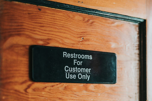
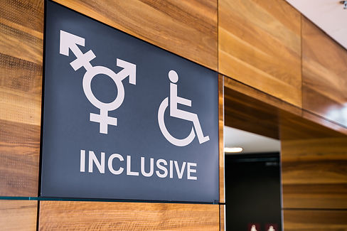
Transgender and non-binary people need reliable information about restroom safety and business policies, such as whether a purchase is required. Despite the growing availability of gender-neutral restrooms, users often lack clear, trustworthy details. The tinkl app aims to solve this, but key information and interactions need refinement to ensure people can access restrooms safely and confidently.
The Solution
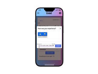
To improve usability and clarity within the existing tinkl functional prototype, several core interactions were refined, including how users view detailed restroom information, access business information, and filter locations by safety or support services. An experience-rating tool was also created—allowing users to evaluate safety, submit comments, and receive clear submission confirmation—to support more accurate and trustworthy restroom data.

Understanding the Problem
Many restrooms lack clear policy information, safety indicators, or consistent user feedback, making it difficult for transgender and non-binary people to know whether a location is welcoming, safe, or requires a purchase.
Cognitive walkthroughs and contextual inquiry revealed key usability gaps: important details were hard to find, some terminology caused confusion, and the available information often felt unreliable. These insights highlighted the need for clearer restroom details, more intuitive interactions, and a trustworthy system for sharing safety feedback.
Cognative Walkthrough
A cognitive walkthrough was conducted to determine the usability level of the tinkl app from the user perspective before conducting a walkthrough with a representative primary user.
The user was asked to complete 13 different tasks to better understand the user experience within the existing version of the app. This approach generated contextual inquiry data.

This is one of the tasks evaluated during the cognitive walkthrough session. Select this link to view the cognitive walkthrough document.
Contextual Inquary
To understand how users interact with the existing tinkl prototype in real scenarios, contextual inquiry sessions were conducted with transgender and non-binary participants. These sessions revealed how people searched for restrooms, interpreted safety information, and navigated unclear business policies. Observing users in context highlighted gaps in clarity, terminology, and trust—insights that directly informed the redesign of key screens and interactions.
What Went Well
• Users appreciated the ability to plan ahead and feel safer when locating restrooms.
• Low barrier to entry made the app easy to begin using.
• The concept increased perceived accessibility of restrooms.
What Can Be Improved
• Unclear whether users could access restrooms without making a purchase.
• Safety of locations was difficult to confirm with confidence.
• Users expressed interest in a stronger network of safe, supportive businesses.
Design Concepts
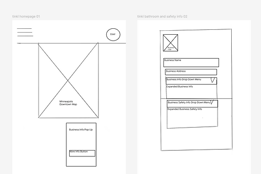
Early design concepts focused on clarifying how restroom details, business information, and safety signals could be presented more intuitively within the existing tinkl prototype. Digital sketches were created to explore layout options, new interaction patterns, and clearer ways for users to access key information—such as business policies, safety ratings, and additional details.
These early iterations helped define the structure of the redesigned features and provided a foundation for subsequent prototype refinements.
Interactive Prototype
The iterated interactive prototype demonstrates the refined features created through cognitive walkthroughs and contextual inquiry. It includes improved access to restroom details, clearer business information, new safety-rating functionality, and streamlined interactions for submitting feedback. These updates were integrated directly into the existing tinkl prototype to support a safer and more intuitive restroom-finding experience.

Select the image to try the interactive prototype.
Iterated Prototype Walkthrough Video
This walkthrough demonstrates the refined tinkl prototype and highlights the updated interactions created throughout the design process. The video showcases how users can view detailed restroom information, access business policies, filter locations by safety or support services, and submit safety ratings with comments. Each redesigned screen is shown in context to illustrate how the improvements enhance clarity, usability, and confidence for users seeking safe and accessible restroom options.
Reflection
Working on the tinkl project deepened my understanding of how small interaction details can significantly impact user safety, confidence, and accessibility. The project taught me how to evaluate an existing functional prototype with a critical eye, identify usability barriers, and refine key interactions in a way that directly supports the needs of transgender and non-binary users. Focusing on clarity, safety signals, and trustworthy information reinforced the importance of designing with empathy and intention — especially when working on products that affect people’s daily sense of security.
One of the most meaningful challenges I encountered was translating research insights into improvements that were both feasible and genuinely helpful. Cognitive walkthroughs and contextual inquiry revealed where users hesitated, what information they doubted, and what details they relied on to feel safe. Turning those findings into clearer navigation, more intuitive interaction patterns, and a reliable rating system required careful thought and close attention to accessibility and communication.
My proudest moment was seeing the redesigned interactions come together in the iterated prototype. The updated flows made safety information easier to interpret, reduced uncertainty around business policies, and gave users a clearer way to share their experiences. Even small improvements — like how details were grouped, labeled, or revealed — contributed to a more supportive and trustworthy restroom-finding experience.