


UX Strategy for Wildlife Hazard Forecasting
Summary
As the UX lead for WHFT, I created foundational deliverables to support early-stage design strategy for a wildlife hazard forecasting tool. Through competitor analysis, moodboard development, and concept visualizations, I helped shape the platform’s initial direction with a focus on visual clarity, aviation context, and user trust. This case study explores how early research and strategy informed the visual concept and laid the groundwork for future development.
Methods
Competitive Analysis, Mood board, Concept Visualizations/Mockups
Tools
Figma, Keynote, Microsoft Excel, Mockuuups Studio
The Problem
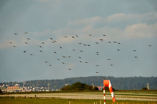
Wildlife-related incidents remain a significant risk to aviation safety. However, existing platforms often lack intuitive design and clear visualizations, making it difficult to assess threats quickly and confidently. There’s a need for a more user-centered, strategic approach to forecasting hazards — one grounded in clarity, accessibility, and trust.
The Solution
I contributed UX strategy artifacts to guide early development of WHFT, focusing on visual clarity and aviation context. Through secondary research and competitive analysis, I identified gaps in existing tools and explored early directions through a mood board and three concept mockups. These visualizations helped define the platform’s potential and laid the groundwork for future UX design.

Understanding the Problem
Wildlife-related hazard events continue to pose serious threats to aviation safety, yet digital tools used to assess these risks are often lacking cohesion, usability, and modern functionality. Through competitive analysis and secondary research, I evaluated similar tools used in aviation safety and environmental monitoring. Many existing platforms made it harder for aviation teams to interpret hazard data efficiently. These insights helped shape the foundation for a clearer, more strategic UX approach to support decision-making and environmental awareness.

Competitive Analysis
To understand how wildlife hazards are currently addressed in aviation technology, I conducted a competitive analysis of platforms related to airport safety, weather tracking, and environmental monitoring. I examined each tool’s purpose, visual design, device compatibility, and available features.
Across these tools, I observed recurring limitations—many lacked cohesion, struggled with outdated or cluttered interfaces, and weren’t optimized for mobile use. These insights shaped the direction of our early UX strategy by highlighting the need for a more focused, accessible, and visually clear approach to wildlife hazard awareness.

Mood Board: Visual & Interaction Direction
To translate early research insights into visual strategy, I developed a mood board that reflects WHFT’s core themes: aviation, hazard detection, and environmental awareness. Each image and color swatch was selected to balance urgency with clarity, technical depth with user-centered simplicity.
The palette reinforces trust and visibility in high-stakes settings, while imagery nods to predictive radar systems, flight instrumentation, and nature itself. This board laid the foundation for subsequent concept sketches and helped align stakeholders on the visual language and tone of the platform.

Concept Mockups: Cross-Device Visualization
To translate abstract ideas into tangible form, I created three high-fidelity concept mockups that reflect WHFT’s early visual strategy. These were not interactive prototypes, but thematic explorations—intended to spark discussion, align stakeholders, and demonstrate how the platform’s design could look and feel across multiple devices.
Each mockup communicates core themes:
• Predictive radar systems and aviation mapping
• Visual clarity in high-stakes contexts
• Adaptability across mobile, tablet, and desktop


Phase 1 UX Report: Foundation for WHFT
This report captures the earliest UX strategy work for the Wildlife Hazard Forecast Tool (WHFT), a digital product designed to help aviation professionals anticipate and mitigate wildlife strike risks.
It includes secondary research, competitive analysis, and early concept visualizations—all developed to explore interface possibilities, align with stakeholder goals, and establish a strong UX foundation for future phases.

Reflection
Working on the WHFT project taught me how to navigate a large-scale, multi-phase initiative with clarity and purpose. I learned the value of structuring complex work into manageable phases that each push the product vision forward, while collaborating with a cross-functional team of designers, researchers, and developers. Aligning with stakeholders and staying grounded in the project’s mission helped ensure our work stayed strategic and meaningful.
One of the greatest challenges I faced was managing collaboration across multiple disciplines while keeping everyone aligned with stakeholder expectations. I worked to foster open communication and guided the team through unexpected changes and pivot points, helping ensure a smooth workflow so that each person could continue doing their best work.
My proudest moment was looking back at what we accomplished despite our limited experience with a project of this scale. We navigated uncertainty, adapted as needed, and contributed work that supported our client’s vision — something that made all of us proud.
Through this project, I discovered that I’m capable of leading and coordinating multi-disciplinary teams, even in unfamiliar territory. It showed me that with the right mindset, collaboration, and persistence, I can help deliver strong, strategic outcomes no matter the complexity.
If I were to do it again, I would bring the lessons and experience from this project to lead even more confidently. The challenges we faced helped strengthen both my UX and leadership skills — and I’d carry that growth into any future project.